Interaction / Moderation with or without Correlation / Association
I. The Question
One of the most common stats questions I got this year was “Can there be interaction/moderation without correlation/association?”. Of course, the short answer is yes, significant interaction/moderation exist without any correlation/association, and vice versa.
The longer answer, I prefer to split into two discussion:
- The first will be a simulation-based answer aimed at alleviating doubt about the factual nature of the answer. In this virtual tour we can make uncorrelated variables interact to explain outcomes, or coerce correlated variables not to have interaction effects. We can create at will artificial interactions or obscure real ones in our analyses.
- The second will be an empirical and rational answer that aims to return the reader to the real world where human logic and instrumentation meets the irreducible complexity of our universe. Here we discuss that most outcomes are produced by interactions, but that our universe seems to obey a hierarchical ordering of effects principle, so correlation should be much more common than interaction. Nevertheless, in real world science, our main concern should remain on weed out spurious or artifactual relationships - be it correlations or interactions - and this task cannot be accomplished by statistics alone.
I will try to do most of the work in base R and will use packages only for data simulation, as well as plotting and table rendering. Used pacakg:
MASSfor mvrnorm() to simulate multivariate normally distributed data;bindatafor rmvbin() to simulate multivariate binary data;ggplot2for plotting;cowplotfor pasting plots together;gtfor pretty html tables; also exports pipe operator %>%;gtsummaryfor pretty html tables of lm() or aov() objects.
Also gt_apa_style() and theme_apa() are declared silently (see this post’s code for references of these functions) and are only useful for APA style table rendering and plotting, respectively.
II. Simulation-based answer
II. 1. Interaction of continuous variables
Here we will demonstrate how to simulate data with weakly correlated variables that have interaction effects. We will use the simple OLS Regression formula to do this.
Regression: $$ y = \beta_0 + \beta_1X_1 + \beta_2X_2 + \beta_3X_1X_2 + e $$
1) Simulate data
Simulate data for two uncorrelated standard normal variables. Use OLS formula to simulate a third variable that is associated with the product (multiplicative interaction) of the first two.
## Simple OLS simulation - moderation/interaction without correlation
set.seed(42)

# Construct a correlation matrix for two uncorrelated normal variables
rho <- 0
m <- matrix(c(1, 0, 0, 1), nrow = 2)

# Simulate 200 data points for x1 and x2 that are normally distributed and uncorrelated
data <-  MASS::mvrnorm(n = 200, mu = c(0, 0), Sigma = m, empirical = TRUE)
data <- as.data.frame(data)
colnames(data) <- c("x1", "x2")
data$x1x2 <- data$x1 * data$x2     # interaction term is simple multiplication of x1 and x2

# Simulate outcome y according with OLS equation
beta1 <- .0001
beta2 <- .0001
beta3 <- .60
error <- rnorm(200, 0, sqrt(1 - (beta1^2 + beta2^2 + beta3^2)))
data$y <- beta1*data$x1 + beta2*data$x2 + beta3*data$x1x2 + error
2) Check the correlation table
# Check correlation
data[, c("x1", "x2", "y")] %>%
  cor() %>%
  as.data.frame() %>%
  round(2) %>%
  gt::gt(rownames_to_stub = TRUE) %>%
  gt::tab_header(title = "Correlation Table") %>%
  gt_apa_style(container.width = "50%", container.overflow.x = FALSE)  # hacky way of not showing y scroll bar when rendering
| Correlation Table | |||
|---|---|---|---|
| x1 | x2 | y | |
| x1 | 1.00 | 0.00 | 0.08 |
| x2 | 0.00 | 1.00 | -0.03 |
| y | 0.08 | -0.03 | 1.00 |
3) Check the regression table
# Check linear regression output
lm_fit <- lm(y ~ x1 + x2, data = data)
lm_fit_int <- lm(y ~ x1 + x2 + x1:x2, data = data)

gtsummary::tbl_regression(lm_fit_int) %>%
  gtsummary::bold_p() %>%
  gtsummary::as_gt(include = -tab_footnote) %>%
  gt::tab_header(title = "Regression Table") %>%
  gt_apa_style() %>%
  gt_apa_style(container.width = "65%", container.overflow.x = FALSE)  # hacky way of not showing y scroll bar when rendering
| Regression Table | |||
|---|---|---|---|
| Characteristic | Beta | 95% CI | p-value |
| x1 | 0.03 | -0.09, 0.14 | 0.6 |
| x2 | 0.05 | -0.07, 0.17 | 0.4 |
| x1 * x2 | 0.51 | 0.39, 0.62 | <0.001 |
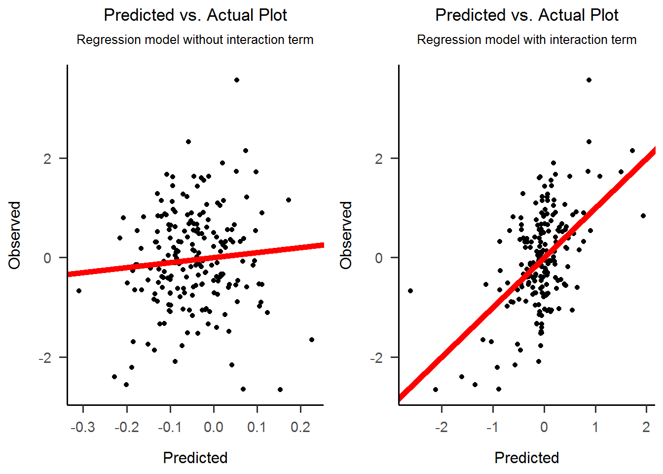
4) Fitted vs Actual Plot
We will fit two regression models. The first comprises only the additive effects (i.e. only the predictors, no interaction term), while the second is the full model comprising both predictors and their interaction. From the two plots it is clear that the interaction term brings most of the explanatory power.
# Fitted vs Actual Plot
data_lm_fit <- data.frame(Predicted = predict(lm_fit), Observed = data$y)
data_lm_fit_int <- data.frame(Predicted = predict(lm_fit_int), Observed = data$y)

obspred_plot1 <-
  ggplot(data_lm_fit, aes(x = Predicted, y = Observed)) +
  geom_point() +
  geom_abline(intercept = 0, slope = 1, color = "red", size = 2) +
  ggtitle("Predicted vs. Actual Plot", subtitle = "Regression model without interaction term") +
  theme_apa()

obspred_plot2 <-
  ggplot(data_lm_fit_int, aes(x = Predicted, y = Observed)) +
  geom_point() +
  geom_abline(intercept = 0, slope = 1, color = "red", size = 2) +
  ggtitle("Predicted vs. Actual Plot", subtitle = "Regression model with interaction term") +
  theme_apa()

cowplot::plot_grid(obspred_plot1, obspred_plot2)
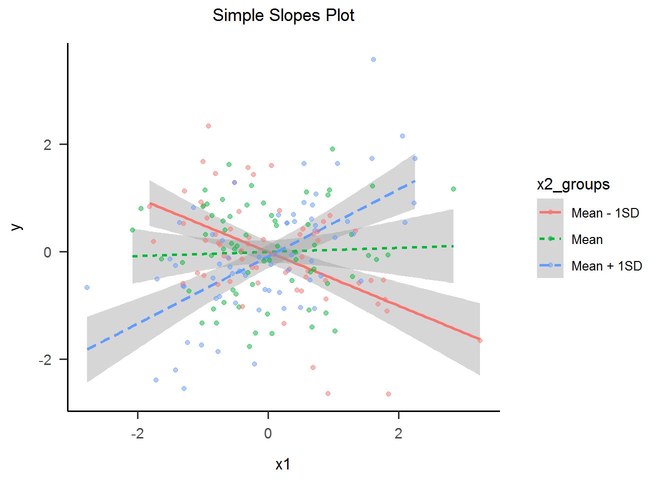
4) Simple Slopes Plot
For us humans, understanding interactions between continuous variables is hard. This is why a standard visualization named “Simple Slopes” tries to convey the interactions meaning by categorizing one of the predictors. This of course, is an oversimplification of the relationship, but it is one that we can readily understand. Now, the effect of the interaction is clear as day.
# Simple slopes plot
modxnames <- c("Mean - 1SD",
               "Mean",
               "Mean + 1SD")
modxvals <- c(mean(data$x2) - sd(data$x2),
               mean(data$x2),
               mean(data$x2) + sd(data$x2))
mod_val_qs <- ecdf(data$x2)(sort(modxvals))  # Use ecdf function to get quantile of the modxvals
cut_points <- c()
for (i in 1:(length(modxvals) - 1)) {                             # split the data in a way that roughly puts each modxvals in the middle of each group
  cut_points <- c(cut_points, mean(mod_val_qs[i:(i + 1)]))        # see https://github.com/jacob-long/interactions/blob/master/R/int_utils.R
}
cut_points <- c(-Inf, quantile(data$x2, cut_points, na.rm = TRUE), Inf)
data$x2_groups <- cut(data$x2, cut_points, labels = modxnames)

sslope_plot <-
  ggplot(data, aes(x = x1, y = y, group = x2_groups, lty = x2_groups, color = x2_groups)) +
    geom_smooth(method = "lm", formula = y ~ x) +
    geom_point(alpha = 0.5) +
    ggtitle("Simple Slopes Plot") +
    theme_apa()

sslope_plot
II. 2. Interaction with categorical variables
As we have seen with the Simple Slopes procedure, interaction/moderation is easiest to understand when it between fewer, rather multiple, and dichotomous, rather than polytomous or continuous.
Here we will use the example of 2x2 Between Subjects Factorial ANOVA, where A and B are independent variables.
The data we are about to simulate mimics two types of very common data sources:
- a cross-sectional observational study (with independent groups): A and B may be both changing or unchanging subject characteristics (e.g. A = male/female, B = urban/rural)
- a 2x2 factorial experimental design (with independent groups): A and B must be experimental manipulations, and may also comprise changing or unchanging subject characteristics (e.g. A = treatment/placebo, B = male/female)
2x2 ANOVA: $$ y = \beta_0 + \beta_1A + \beta_2B + \beta_3AB + e $$
1) Simulate data
Simulate data for two uncorrelated binary variables. Use OLS formula to simulate a third variable that is associated with the product (multiplicative interaction) of the first two.
## 2x2 ANOVA model simulation
set.seed(42)

# Construct a correlation matrix for two uncorrelated binary variables
rho <- 0
m <- matrix(c(1, rho, rho, 1), nrow = 2)

# Simulate 200 data points for factors A and B that are binary and uncorrelated
data <-  bindata::rmvbin(n = 200, margprob = c(0.25, 0.25), bincorr = m)
## Warning in regularize.values(x, y, ties, missing(ties), na.rm = na.rm):
## collapsing to unique 'x' values
data <- as.data.frame(data)
colnames(data) <- c("A", "B")
data$AB <- data$A * data$B     # interaction term is simple multiplication of x1 and x2

# Simulate outcome y according with OLS equation
beta1 <- .0001
beta2 <- .0001
beta3 <- .82
error <- rnorm(200, 0, sqrt(1 - (beta1^2 + beta2^2 + beta3^2)))
data$y <- beta1*data$A + beta2*data$B + beta3*data$AB + error
2) Check the correlation table
# Check correlation
data[, c("A", "B", "y")] %>%
  cor() %>%
  as.data.frame() %>%
  round(2) %>%
  gt::gt(rownames_to_stub = TRUE) %>%
  gt::tab_header(title = "Correlation Table") %>%
  gt_apa_style() %>%
  gt_apa_style(container.width = "65%")  # hacky way of not showing y scroll bar when rendering
| Correlation Table | |||
|---|---|---|---|
| A | B | y | |
| A | 1.00 | -0.06 | 0.08 |
| B | -0.06 | 1.00 | 0.10 |
| y | 0.08 | 0.10 | 1.00 |
3) Check the ANOVA table
There seems to be an interaction effect!
# Check ANOVA output
aov_fit <- aov(y ~ A + B + A:B, data = data)
gtsummary::tbl_regression(aov_fit) %>%
  gtsummary::modify_header(sumsq ~ "**Sum Sq**", statistic ~ "**F value**") %>%
  gtsummary::bold_p() %>%
  gtsummary::as_gt() %>%
  gt::tab_header(title = "ANOVA Table") %>%
  gt_apa_style() %>%
  gt_apa_style(container.width = "50%", container.overflow.x = FALSE)  # hacky way of not showing y scroll bar when rendering
| ANOVA Table | |||
|---|---|---|---|
| Characteristic | Sum Sq | F value | p-value |
| A | 0.492 | 1.37 | 0.2 |
| B | 0.843 | 2.35 | 0.13 |
| A * B | 1.73 | 4.82 | 0.029 |
4) Interaction Plot
Now, I can see the interaction effect, clear as day.
# Interaction plot
int_plot1 <-
  ggplot(data, aes(x = as.factor(A), y = y, group = as.factor(B), shape = as.factor(B))) +
  stat_summary(fun = "mean", geom = "point", size = 4, color = "black") +
  stat_summary(fun = "mean", geom = "line", color = "black") +
  stat_summary(fun.data = "mean_se", geom = "errorbar", width = .1, color = "black") +
  ggtitle("Interaction Plot") +
  xlab("A") +
  labs(shape = "B", color = "B") +
  theme_apa()

int_plot1 +
  annotate("rect", xmin = -.2, xmax = 1.1, ymin = -.11, ymax = .13, alpha = .2, color = "blue") +
  annotate("text", x = 0.4, y = 0, label = "When B changes \n from 0 to 1,\n y increases\n very little") +
  annotate("rect", xmin = 1.9, xmax = 3, ymin = -.16, ymax = .77, alpha = .2, color = "blue") +
  annotate("text", x = 2.5, y = .22, label = "When B changes \n from 0 to 1,\n y increases\n quite a lot")
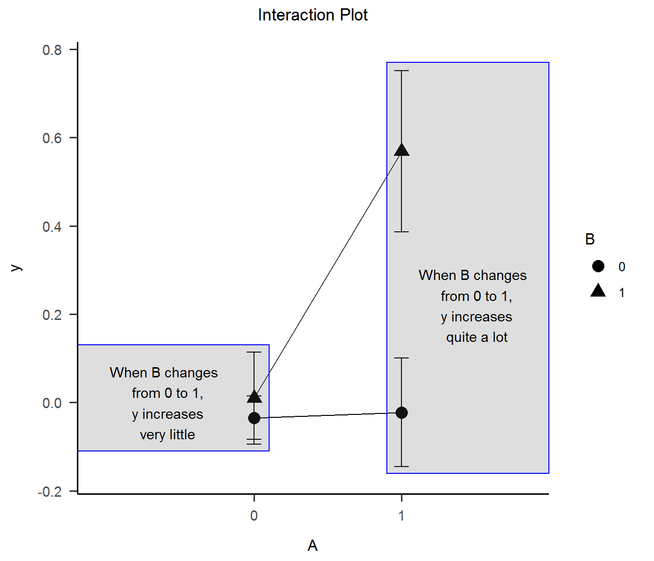
It’s good to mention that the Interaction Plot is typical in ANOVA papers. Focusing on means (or medians) allows the plot to rescale the Oy axis around them, taking the interaction more visible.
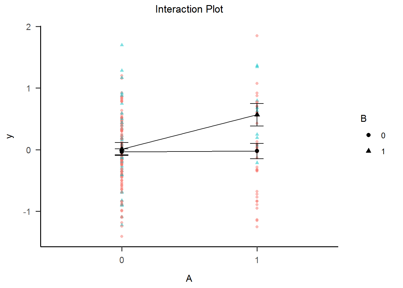
Of course, if we plot the actual data point and coerce the Oy axis to take the full scale of the y variable, the interaction in the plot doesn’t look so huge anymore. This is the most common way graphs lie about interactions!
int_plot2 <-
  ggplot(data, aes(x = as.factor(A), y = y, group = as.factor(B), shape = as.factor(B))) +
    geom_point(aes(color = as.factor(B)), alpha = .5) +
    stat_summary(fun = "mean", geom = "point", size = 2.2, color = "black") +
    stat_summary(fun = "mean", geom = "line", color = "black") +
    stat_summary(fun.data = "mean_se", geom = "errorbar", width = .1, color = "black") +
    ggtitle("Interaction Plot") +
    xlab("A") +
    labs(shape = "B", color = "B") +
    theme_apa()

int_plot2
II. 3. Artifactual interaction due to categorization
1) Simulate data
Similarly to how we did first time, we start with three continuous standard normal correlated variables. Then we categorize the predictors into dichotomous variables A and B using median split and splitting on the 80th Percentile.
## 2x2 ANOVA model simulation - artifactual interaction due to categorization
set.seed(42)

# Construct a correlation matrix for two correlated normal variables
rho <- 0
m <- matrix(c(1, 0.4, 0.4, 1), nrow = 2)

# Simulate 200 data points for A and B that are normally distributed
data <-  MASS::mvrnorm(n = 200, mu = c(0, 0), Sigma = m, empirical = TRUE)
data <- as.data.frame(data)
colnames(data) <- c("A", "B")
data$AB <- data$A * data$B     # interaction term is simple multiplication of A and B

# Simulate outcome y according with OLS equation
beta1 <- .70
beta2 <- .70
beta3 <- .0001
error <- rnorm(200, 0, sqrt(1 - (beta1^2 + beta2^2 + beta3^2)))
data$y <- beta1*data$A + beta2*data$B + beta3*data$AB + error

# Categorize A and B
data$A_med <- cut(data$A, breaks = c(-Inf, quantile(data$A, 0.5), Inf), labels = c("below Median", "above Median"))
data$B_med <- cut(data$B, breaks = c(-Inf, quantile(data$B, 0.5), Inf), labels = c("below Median", "above Median"))
data$A_p80 <- cut(data$A, breaks = c(-Inf, quantile(data$A, 0.75), Inf), labels = c("below P80", "above P80"))
data$B_p80 <- cut(data$B, breaks = c(-Inf, quantile(data$B, 0.75), Inf), labels = c("below P80", "above P80"))
2) Check number of observation by condition with frequency table
# Check factor table
cond_freq_tab1 <- table(data$A_med, data $B_med) %>% as.data.frame() %>% gt::gt(rownames_to_stub = TRUE) %>% gt_apa_style()
cond_freq_tab2 <- table(data$A_p80, data $B_p80) %>% as.data.frame() %>% gt::gt(rownames_to_stub = TRUE) %>% gt_apa_style()
cond_freq_tab1 %>%
  gt_apa_style(container.width = "50%", container.overflow.x = FALSE)  # hacky way of not showing y scroll bar when rendering
| Var1 | Var2 | Freq | |
|---|---|---|---|
| 1 | below Median | below Median | 62 |
| 2 | above Median | below Median | 38 |
| 3 | below Median | above Median | 38 |
| 4 | above Median | above Median | 62 |
cond_freq_tab2 %>%
  gt_apa_style(container.width = "50%", container.overflow.x = FALSE)  # hacky way of not showing y scroll bar when rendering
| Var1 | Var2 | Freq | |
|---|---|---|---|
| 1 | below P80 | below P80 | 122 |
| 2 | above P80 | below P80 | 28 |
| 3 | below P80 | above P80 | 28 |
| 4 | above P80 | above P80 | 22 |
3) Check the ANOVA table
An interaction effect is created from thin air!
# Check ANOVA output
aov_fit_med <- aov(y ~ A_med + B_med + A_med:B_med, data = data)
aov_fit_p80 <- aov(y ~ A_p80 + B_p80 + A_p80:B_p80, data = data)

gt_aov_med <- gtsummary::tbl_regression(aov_fit_med) %>%
  gtsummary::modify_header(sumsq ~ "**Sum Sq**", statistic ~ "**F value**") %>%
  gtsummary::bold_p()
gt_aov_p80 <- gtsummary::tbl_regression(aov_fit_p80) %>%
  gtsummary::modify_header(sumsq ~ "**Sum Sq**", statistic ~ "**F value**") %>%
  gtsummary::bold_p()

gtsummary::tbl_merge(list(gt_aov_med, gt_aov_p80), tab_spanner = c("**Median Split**", "**P80 Split**")) %>%
  gtsummary::as_gt() %>%
  gt_apa_style() %>%
  gt_apa_style(container.width = "95%", container.overflow.x = FALSE)  # hacky way of not showing y scroll bar when rendering
| Characteristic | Median Split | P80 Split | ||||
|---|---|---|---|---|---|---|
| Sum Sq | F value | p-value | Sum Sq | F value | p-value | |
| A_med | 122 | 258 | <0.001 | |||
| B_med | 68.5 | 145 | <0.001 | |||
| A_med * B_med | 0.044 | 0.093 | 0.8 | |||
| A_p80 | 92.3 | 162 | <0.001 | |||
| B_p80 | 76.2 | 134 | <0.001 | |||
| A_p80 * B_p80 | 2.74 | 4.81 | 0.029 | |||
III. Empirical and rational answer
Until this point we have simplified our discussion to only deal with statistical interaction. Statistical interactions are only a deviation from a specified model form. Here, we have only presented a multipicative statistical interaction, but many such functional forms could exist in the wild (e.g. sin(x1 + x2)). Also, nonlinear effects of individual predictors can masquerade as interaction effects between correlated predictors (Belzak & Bauer, 2019). Data features like multicollinearity of predictors (Sithisarankul et al., 1997) may lead to artificial interaction effects (I would call these spurious). Statistical procedures like categorization of continuous predictors (Thoresen, 2019) may lead to artificial interaction effects (I would call these artifactual).
Most outcomes are not caused by a single factor in isolation, but by multiple in combinations. Nevertheless, in the real world we deal with unreasonable numbers of such factor and usually only a small proportion of the factors will have significant effects. This fact has been called the effect sparsity principle (Box & Meyer, 1986). Just as two planets will line up with the moon more frequently than three planets, main effects are more likely than two-factor interactions, and two-factor interactions are more likely than three-factor interactions etc. This phenomena has been termed “the hierarchical ordering principle” (Wu & Hamada, 2000).
Unfortunately, answering the question only at the level of statistical interaction leaves out the true structure of world and our understanding void of the of the causal underpinnings of the correlations and interactions we sometimes detect and sometimes don’t.
III. 1. Counterfactual reasoning
Similarly to Judea Pearl’s genius Ladder of Causation, I like to think about a hierarchy of interaction: statistical interaction -> causal interaction -> mechanistic interaction. To move from probabilistic conclusions to causal one, some assumptions have to be met (e.g. no unmeasured confounding, correctly specified model etc.), and similarly to move from the causal to the mechanistic further conditions have to be met. Without going into detail, a statistical interaction may not correspond to a causal one, while a causal interaction may not map to any one mechanistic interaction.
Unfortunately, a blog post cannot familiarize readers with causal inference, the counterfactual framework or the directed acyclic graphs (DAG) used as common representation method. However, I will try to shed more light on a common misunderstanding from conflating effect modification with causal interaction. The following simplified explanations heavily rely on work of Bours (2021), VanderWeele & Robins (2007), VanderWeele (2009), and works of Herman and Robins (2009). Readers are advised to read the primary sources.
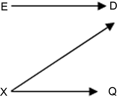
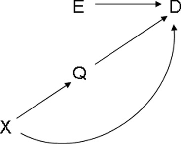
Effect modification = the causal effect on outcome D of one factor E differs across levels of a second factor Q. This is akin to typical effect heterogeneity in epidemiology and moderation in social sciences, in that relationship between E and Q is asymmetric: the focus is on the causal effect of E on D that only varies across strata of Q (Q may be an unchanging natural category or it may even have no causal effect on D at all).
Causal interaction = the joint causal effect of two factors E and Q on outcome D differs from their expected combined effect. Causal interaction is essentially a symmetric concept - both factors have an equal status in the definition of interaction and if manipulation of any is possible it will result in outcome change.
VanderWeele and Robins (2007) showed that a variable Q could serve as an effect modifier for the effect of E on D even if Q had no causal effect on D. This happens in effect modification by common cause or effect modification by proxy. But more importantly, VanderWeele (2009) gives the following two examples:
Effect modification without causal interaction
Effect modification by Q of the effect of E on D without causal interaction between the effects of E and Q on D (VanderWeele, 2009).
“E denotes some drug in a randomized trial, D denotes hypertension, X denotes a person’s genotype, and Q denotes the person’s hair color. In this example, Q might serve as an effect modifier for the effect of E on D since Q is a proxy for X. Q has no effect whatsoever on D. Interventions on Q do nothing to D, so there can be no interaction between E and Q” (VanderWeele, 2009).
Causal interaction without effect modification
Causal interaction between the effects of E and Q on D without effect modification by Q of the effect of E on D. (VanderWeele, 2009).
“E denotes a drug in a randomized trial for weight loss for obese children, D denotes the final weight of a child 6 months after the trial completion, X denotes the sugar intake in a child’s diet, and Q denotes some measure of exercise. Sugar intake might, for example, affect exercise by making children more hyperactive. Suppose further that the effects of the diet drug E and exercise Q interact. In other words, if we were to intervene to give children the drug and also to force exercise, then the effect of these 2 interventions together, compared with the baseline of no drug and no exercise, would be greater than the sum of the effects of each intervention considered separately. We would then say that there is an interaction between the effects of E and Q on D. However, it does not follow from this that Q is an effect modifier for the effect of E on D. Suppose that sugar intake had 2 effects on weight; first, high levels of sugar intake within the diet will likely increase weight gain; second, sugar intake might give children more energy, making them hyperactive and thus more likely to exercise, and thereby lowering their weight through exercise. It is furthermore possible that the indirect effect of sugar intake that lowers weight through exercise essentially cancels out the direct effect of sugar intake which increases weight” (VanderWeele, 2009).
So, if we were to fit the same types of models we presented until this point using variables D, E and Q, and our primary interest would be the statistical interaction effect (E*Q) on outcome D, we would find that:
- in the first example (effect modification without causal interaction) we may find a significant statistical interaction effect (if sample size and effect modification magnitude are large enough), even though there is no causal interaction;
- in the second example (causal interaction without effect modification) we won’t find a significant statistical interaction effect, even though there really is a causal interaction.
References
- Belzak, W. C., & Bauer, D. J. (2019). Interaction effects may actually be nonlinear effects in disguise: A review of the problem and potential solutions. Addictive behaviors, 94, 99-108.
- Sithisarankul, P., Weaver, V. M., Diener-West, M., & Strickland, P. T. (1997). Multicollinearity may lead to artificial interaction: an example from a cross sectional study of biomarkers. The Southeast Asian journal of tropical medicine and public health, 28(2), 404-409.
- Thoresen, M. (2019). Spurious interaction as a result of categorization. BMC medical research methodology, 19(1), 1-8.
- Box, G. E. P. and Meyer, R. D. (1986). An analysis for unreplicated fractional factorials. Technometrics, 28, 11-18.
- Wu, C. F. J. and Hamada, M. (2000). Experiments-Planning, Analysis, and Parameter Design Optimization. New York: John Wiley & Sons.
- Bours, M. J. (2021). Tutorial: A nontechnical explanation of the counterfactual definition of effect modification and interaction. Journal of clinical epidemiology, 134, 113-124.
- VanderWeele, T. J., & Robins, J. M. (2007). Four types of effect modification: a classification based on directed acyclic graphs. Epidemiology, 18(5), 561-568.
- VanderWeele, T. J. (2009). On the distinction between interaction and effect modification. Epidemiology, 20(6), 863-871.
- Hernán M.A. & Robins J.M. (2020). Causal Inference: What If. Boca Raton: Chapman & Hall/CRC.